URL: http://porttityoelamaan.fi/
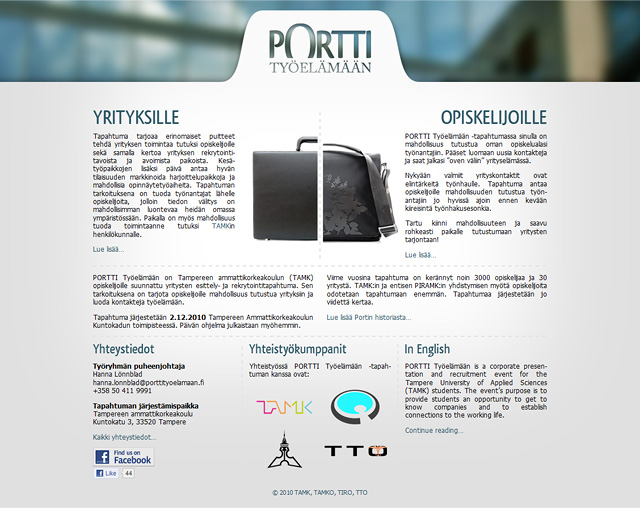
The client wanted an updated and uncluttered site where visitors could easily find information about the event. The website had two main audiences, companies who seek trainees or employees and students who could be those trainees/employees. This lead me to sort of divide the layout in to two halves.
For the new logo I didn’t want to settle for the most obvious solution of a gate (portti = gate) but still wanted to have something more than just text. Cut off O represents that and ties it in to the logo itself.

